|
Make Menu
Button Images
By default, the menu links on the website
are text.
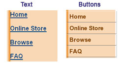
The Make Menu Button Images section allows
you to make buttons for your text links. Every pre-made template
we provide has a button that matches the template you are using.
You also make your own images as well as select an image from the
Button Gallery.
If you are making your
buttons for the first time or making changes to your current
button images - Step
1: you will first want to select Make
New Button with New Options under Current Button Settings.
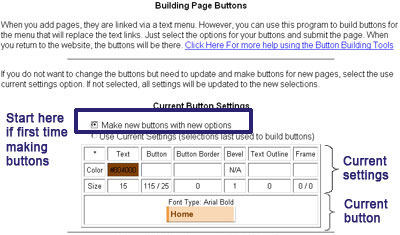
Note: If you rename your pages or add
new pages, you will need to make buttons
for those new pages. You do not have to go through
this initial process. If you like your button settings,
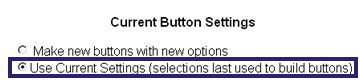
simply select the Use Current Button Setting, scroll down to
the bottom and click on the Make Buttons button.
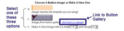
Step 2: scroll down to the
Choose a Button Image or Make a New One section. Pick one of the
three options.
- If you are using a template, you will
see the image that matches the template you are using
displayed first (the beige colored button in the image
above). Right below that image, you will see the words:
image matches the template you are using.
- The second image listed in that
section is either the image you selected from the Button
Gallery or the image you uploaded in the Upload Your Own
Button Image section. If you want to browse through the
image gallery, click on the Click Here to Change link
right below that image.
- The third option is for you to make
your own button. The width of the button will depend on
the length of your button names (which are the same as
your page names such as Home, Browse, About Us, etc.). A
good size to start with is 115 for the length and 25 for
the height.
Step 3 is to select Image
3D Effects and Step 4 is the Choose the Colors.
Setting 3D Effects and Choosing the Colors must be done together
because you will not be able to see some of the 3D effects
without selecting colors or, in some cases, the system will fill
the selections with white space.
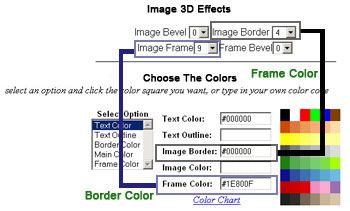
To select Image 3D Effects:
click on the drop down arrows next to the boxes with the numbers
and pick a number. Remember: Just because you can use these
options, does not mean you should. Be careful not go overboard
with your new tools.
To select Colors:
click on the Text Color under Select Option, go over to the color
chart and pick a color. Once you pick a color, you will see the
hexadecimal code pop up in the box next to Text Color. In the
example above you see #000000, which is the hexadecimal code for
black.
Note that here, text outline
was not selected because using a text outline on a thin
font such as My Yummy Apology makes the font disappear. If you
put in a color for text outline here, to see your text outline,
select the size of the text outline in Step 5. A text outline
looks good with thick fonts such as Arial Black. Note also that image
color was not selected because we selected to use
the button that matches the template we are using option rather
than the make a new image with a length of xx and a height of xx
option.
If you would like more color choices, click
on the Color Chart link. In the chart, you can find the right
colors for you. The chart will provide you with the hexadecimal
code. Highlight and copy the code. Click on the back button on
your browser to get back to this window and paste in the code in
the appropriate box. Make sure that you have the
pound symbol (#) in front of the color code.
Finally, you will need to
Set Size, Font & Alignment. To make your selections, click on
the little drop down arrow for each option and pick your choice.
A good Text Size for buttons is anywhere between size 12
and 16. The size will vary with the font you select. A good Font
Type is something easy to read such as Arial or Verdana. Try
to stay away from loopy fonts because those are very difficult to
read when they are small. Your buttons should only be so large
when compared to the rest of your website, so stick to something
that fits in a reasonable amount of space. You can, however, add
additional fonts. Click on the Add Fonts get to the Font Gallery. After you add the font, you will see it listed in
your Font Type drop down menu.
You can change the Alignment to Left,
Center and Right. We selected left for this example because the
buttons are aligned to the left in the template. If your buttons
are centered or aligned to the right with respect to the template,
then you can change the alignment. You can also change the Edge
Space for the buttons. Here, the edge space is set to two
because the button we have has a little line on the left hand
side and we do not want the text crossing that line.
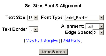
When you finish making your selections
click on the Make Buttons button at the bottom.
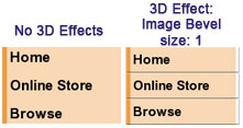
Using the selections above (button that
matches the template we are using), here is what we get:
Modifying the selections above slightly, we
get:
To see your buttons, click on
the Website Home icon at the top. This will take you the home
page of your website. If you cannot see the changes you made,
make sure you refresh your page. If
you do not see that your buttons changed even after you refreshed
your page, make sure that you selected the Make New Buttons with
New Options choice under the Current Button Setting section (see
Step 1 above).
|