|
Multi Level
Menu Colors & Settings
Note: This feature
uses CSS and JavaScript. As discussed on other pages,
JavaScript is not supported by all browsers. Similarly, CSS is
not supported by all browsers. Internet Explorer, in particular,
has some issues with CSS. If you use this feature, you MUST stay
up to date on the latest browser issues so that you can add in
patches as necessary. We try to do this for you as much as we can,
but we cannot catch everything. It is your responsibility to keep
tabs on updates to browser technology if you are going to use
advanced features.
Keep in mind also, that, even if this menu
works, it may stop working after you add in additional JavaScript.
That is, if your menu works but then you add Google AdWords or
some other program that provides you with JavaScript code, there
may be interference between your menu and that code. When you
make changes, make sure that you
double check your work for possible conflicts. You will know
there is a conflict because, usually, the result is that the menu
does not come up anymore.
We are not telling you this to discourage
you from using this feature. In fact, we have many customers that
use this feature successfully. But you should know in advance the
kinds of problems you may encounter.
Selecting the Multi Level Menu Colors and
Settings is the FIRST step in creating
the multi-level menu. This part is not complicated but notice
that you must specify everything. All you need
to do is go through and pick settings for everything requested:
Menu Alignment (vertical or horizontal), Button Width, Button
Colors, Button Text Colors, Button Border, Font Type, Font Size,
and Menu Alignment within the table of the menu (left, right or
center).
This menu is best used with the Page
Layouts (Basic or Advanced) rather than
the templates because the templates have premade buttons that
match the template. You cannot use those buttons with this menu
because this menu is using CSS. If you use a template and then
use a text based menu, it just makes your website look strange
and messy. This problem is best avoided by not using a template.
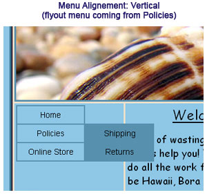
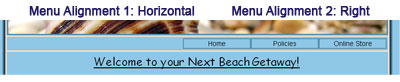
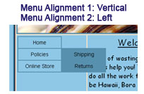
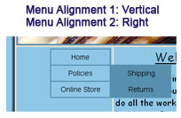
Menu Alignment: The
menu can be aligned vertically or horizontally.
- Horizontal (left to right) - should be
used if your buttons are going across the page rather
than up and down
- Vertical (up and down) - should be
used if your buttons are going up and down rather than
across
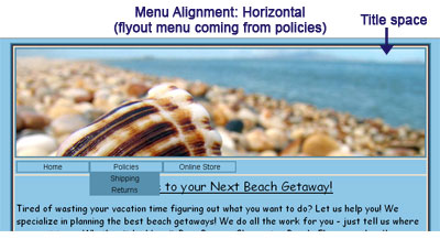
Note: the sub
menu (or flyout menu) comes out ONLY
when someone puts their mouse over the button. Both of the screen
captures were taken when the mouse was over the Policies button.
Button Width: You
need to define the button width. The standard button width is 120
pixels wide. You should pick the settings that will work best for
you based the size of your page names.
- Main Button Width: this is the
size of your main button. In the example above, this
includes the Home, Policies, and Online Store buttons.
- Sub Level Button Width: this is
the size of your sub level button. In the example above,
this included Shipping and Returns.
Note that in the example above, the main
level button and the sub level button are the same width. They do
not need to be the same width - you can select the size that will
work for you.
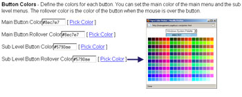
Button Colors: You
need to define the colors for each button: the main button and
the sub level button. You also need to pick colors for the color
the button will be when someone puts their mouse over the button.
To pick a color, click on the Pick Color
link and you will see the color chart pop out. You can also type
in the hexadecimal code into the box (make sure to include the #
symbol in front of the code).
Button Text Colors:
You need to define the text colors for each button: the main text
and the sub level text. You also need to pick colors for the
color the text will be when someone puts their mouse over the
button. You can have the same color for everything or different
colors. Generally, having color consistency is easiest on people's
eyes.
Button Border:
Select the size of the border around each button. The border
width is normally between 1 and 5 with the higher number being
larger. The color can be same as the background, left blank for
spacing with no color or set to any color you want.
Font Type: These
are text buttons. This means that you can only use the five
standard fonts. You can read more about why here.
Font Size: This is
the point size of the font on the menu. Normal web fonts are
between 10 and 16 with the lower number being smaller and the
higher number being larger. You can, however, use any number
between 1 and 99.
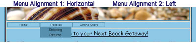
Menu Alignment:
This menu alignment refers to the menu spacing within the table (unlike
the menu alignment at the top, which refers to the menu spacing
on the entire page). You can align the menu Left, Center and
Right.
When you select your settings, click on the
Update Button.
Note: You are not
done yet. You now must Build the New Menu Tree.
|